

How Bouquet Color Affects Its Perception
Why Color Registers Before Variety and Form
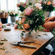
The First Seconds at the Shop Window
A familiar scene: a person walking down the street, phone in hand, mind elsewhere. Then—a brief pause at the shop window. They have not yet noticed whether it’s roses or ranunculus, but their eye has already “caught” on something. The reason is almost always the same: color.
The eye looks for simple signals. Large color blocks are read faster than small details. That’s why a bright spot in a window works like a beacon. Not “beautiful/ugly,” but “noticed/not noticed.” This is where the sale begins: first a stop, then interest, then the question “how much does it cost?”.
In store practice, it looks like this: if the entire display is built in a calm palette, it may look neat but “quiet.” If there are one or two strong color accents, foot traffic slows down more often. After that, variety, packaging, price, and the florist’s words come into play. But color gives the start.
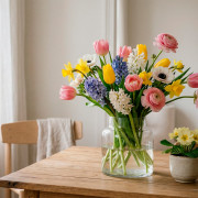
Color as the Bouquet’s “Tone of Voice”: Same Composition, Different Impressions
Color in a bouquet is like intonation in a conversation. The words can be the same, but the impression differs. The same applies here: two bouquets with the same composition but different palettes evoke different reactions.
White is often read as “clean,” “formal,” “ceremonial.” Red as a “strong signal,” “emotion at maximum.” Yellow as “warmth,” “support,” “sunshine.” This is not esotericism or greeting cards; these are fast associations the brain retrieves automatically.
And here is a paradox worth keeping in mind: “liking” and “catching attention” are not always the same thing. A calm palette may be liked. A bright one is more likely to stop someone at the window. Later in the article, we will return to this difference and break it down clearly.
What Can Override Color in a Bouquet
Color almost never works in isolation. Three factors strongly affect perception.
Occasion. The same red on Valentine’s Day reads easily, but as a business gift it may feel “too much.” White for a wedding is classic, but in some contexts it can feel cold, “interior-like.” The occasion is the context that colors perception more strongly than any theory.
Packaging. Matte black wrap increases contrast and can make yellow feel more “premium,” but red in it may become more aggressive. Kraft softens, but sometimes looks “dusty” and dulls fresh light tones. If packaging conflicts with the palette, the bouquet feels as if it were “assembled from different stories.”
Lighting. Warm light often turns white flowers creamy and makes yellow overly buttery. Cold light pushes red toward “raspberry” and makes greens look gray. In a window display, the solution is simple: check the bouquet under the same light the customer will see. Not on the florist’s table, but in the window. The difference can be unpleasant—but it’s better to see it yourself.
What Science Says About Fresh Flowers
A Three-Minute Experiment: What Was Measured and Why It Matters for Florists
There is a rare and useful example of research where the effect of color in fresh flowers was tested not only through “like/dislike” questionnaires, but through physiology. In a study by Xie et al., participants were shown white, red, and yellow roses and asked to simply look at them for 3 minutes. At the same time, EEG (in particular, alpha activity), autonomic nervous system indicators via HRV, and several psychological scales were recorded (full text of the study: https://pmc.ncbi.nlm.nih.gov/articles/PMC8507779/).
Why is this valuable for florists and shop owners? Because it closely resembles real window-display behavior. Customers really do not look for long. Sometimes seconds, sometimes a minute or two if something “hooks” them. And the question is not whether they “understood the bouquet,” but what they felt physically: calm, pleasant, energized, tense, or “nothing.”
Results Without Myths: Relaxation, Stress Markers, Self-Reported Mood
If we restate the findings without grand language, the picture is quite practical.
After viewing yellow and red roses, participants showed more pronounced signs of physiological relaxation and mood improvement compared to white roses.
Briefly, the metrics worth mentioning:
- EEG / alpha activity (prefrontal): mean relative alpha power was higher when viewing yellow and red roses compared to white ones. The authors interpret this as a calmer state.
- Parasympathetic activity / HRV: viewing yellow and red roses noticeably increased parasympathetic activity—the classic “exhale” mode.
- Mood self-assessment (POMS): after viewing yellow and red roses, scores improved on several subscales; in particular, improvements were noted in Vigor and overall mood status.
- Pleasantness/comfort ratings (SD method): yellow and red roses were more often perceived as more relaxing, cheerful, and comfortable than white ones.
Translated into retail language, the conclusion sounds almost simple: warm, bright colors in fresh flowers can generate an “emotional plus” faster, while white more often remains neutral in comparison. And neutrality in a shop window sometimes means the person walked past.
Study Limitations
Now an important part—otherwise the text risks sounding like a marketing fairy tale.
First, the study was conducted during COVID isolation. This affects participants’ emotional background and the very idea of “compensating for lack of nature.”
Second, the exposure was short—3 minutes. This is similar to a window display, but does not describe what happens after an hour, a day, or a week.
Third, a specific set of stimuli was compared: white, red, and yellow roses. The results cannot be automatically applied to all varieties, shades, and compositions.
Still, this is a very useful reference point: bouquet color is not only “symbolism,” but also a physiological response. Which means palette can be treated as a tool, not just a tradition of “this is how gifts are given.”
A Favorite Color and a Color That Feels Easing Do Not Always Match
What Studies on Flower Color Preferences Show
If you ask someone “what bouquets do you like,” they will almost always answer in terms of aesthetics—what looks “beautiful,” “neat,” “not too bright.” That is normal: in a calm setting, we choose with our eyes the same way we choose clothing or interiors.
But preference studies show something curious. In one large survey (in the UK, hundreds of respondents), people were shown images of flowers in different colors and asked to rate attractiveness. At the top of the rankings were light, eye-friendly options, including white flowers, as well as some saturated tones like blue and orange. (sciencedirect.com)
And here is the key takeaway that can be safely used in a blog: “preference” is more about an aesthetic ideal—how a person would like to see flowers at home, in photos, on a table. Buying in flow is a different story. There, taste is joined by the moment.
Why White Is Liked but Does Not Always Stop People at the Window
White in a bouquet is often perceived as neat, safe, “everything will be fine.” It is associated with purity, ceremony, minimalism. This is a strong position—especially for weddings, official gifts, and interior floristry.
But white has a weak spot: it rarely shouts “look at me.” In a window display, white easily gets lost, especially under warm lighting and against a light background. It becomes “background beauty” that the brain registers as part of the overall scenery.
In addition, white is often perceived as a more “complex” choice. Not in the sense of difficult, but in the sense that it requires context. Yellow or red deliver emotion immediately, without explanation. White is more often chosen when the occasion is clear or when the client is already tuned to a specific style.
This is where the two layers we discussed earlier align nicely: in experiments with fresh roses, white flowers produced a weaker response on physiological markers compared to bright yellow and red ones. (pubmed.ncbi.nlm.nih.gov) In a real shop, this often translates simply: white less often slows foot traffic, but closes the sale well once the person has already stopped.
How to Explain This to the Team Without Causing Conflict
The key here is not to fall into a “who is right” argument. A florist may love pastels and white because they are beautiful and professional. A salesperson may push for bright colors because they sell faster. Both are right—the tasks are just different.
A simple explanation works:
- There are display colors. They work as hooks and capture attention.
- There are consultation colors. They close the client’s request and help hit the mark.
- And there are colors for repeat purchases—the ones people return to because they feel comfortable.
In other words, “client taste” is about long-term affinity and style. A “purchase trigger” is about seconds and impulse. The team should be able to switch between these modes without drama. And yes, this can be trained—just like hand placement in floristry.
How Clients Read Popular Bouquet Colors Without Cards or Pomp
Red as a Powerful Signal That Is Easy to Overdo
Red is a fast, strong, almost physical signal. In retail floristry, it often works like an “emotion button.” That’s why red bouquets sell easily in clear scenarios: romance, anniversaries, “I want to impress.”
But red has a downside. It easily becomes “too much.” Too loud, too direct, too “obligating.” Some clients avoid red because it sounds like a statement rather than a gift.
A practical approach is simple: if a client is drawn to red but hesitates, offer red as an accent. Slightly less red, more neutral base—and the bouquet becomes friendlier. This is not a compromise of “blurring everything,” but volume control.
Yellow as Support and Energy Without Pressure
Yellow often works as emotional “support.” It is about warmth, friendliness, “I’m here.” And importantly, this is confirmed not only by cultural associations but also by data on reactions to fresh flowers: yellow roses in the study showed clear signs of relaxation and improved well-being, including increased vigor on mood scales. (pmc.ncbi.nlm.nih.gov)
For a shop, this is gold, because yellow helps close requests where red is inappropriate and white is too neutral: supporting someone, congratulating a colleague, “just to lift the mood.” Another advantage: yellow looks good in a window—it is noticeable but usually does not press as hard as red.
Just don’t go neon. Natural yellow in flowers is about the sun, not a marker pen.
White as Cleanliness, Status, and the Context Where It Sells Best
White sells best when it has a frame: occasion, style, aesthetics. Where a person wants “neat and premium,” a white palette is ideal.
Three situations where white is especially strong:
- weddings and engagements, where a clean, ceremonial image is needed;
- corporate gifts, where neutrality without unintended hints matters;
- interior bouquets, where white works like “clean air” and does not clash with the space.
One more important display note: white almost always wins when it is not made “flat.” Adding greenery, texture, and different bud shapes prevents white from becoming background and turns it into a composition.
Practical Takeaways for Flower Shops and Sales Growth Through Palette
Window Display and Layout Without Chaos or Random Choices
If a window display does not hold attention, you can endlessly improve photos, prices, and assortment—with little effect. The window has one simple job: to stop people. Palette is the fastest lever.
The logic is this: warm shades work like a magnet, neutral ones like a zone of trust. Mixing them randomly is costly.
A solid display layout works like a conversation: first a loud line (anchor), then a calm explanation (neutral zone), and only then details.
A window checklist that actually helps:
- Eye level. At eye level—one main bouquet that hooks immediately.
- One anchor bouquet. Not ten “almost anchors,” but one clear leader in color and impact.
- Background contrast. A bright bouquet on a background where it does not drown; white—not on a white wall without support.
- Warm zone and calm zone. Warm (yellow, red, orange, warm pastels) separately; neutral (white, cream, greenery) separately.
- Quiet zone. One area where the eye can rest. White and cream textured compositions work well here.
- Seasonal accents. Spring—light warm pastels; summer—bright spots; autumn—deep warm tones; winter—white and greenery, but with clear contrast.
- Check under your lighting. What looks great on the florist’s table may look flat under display lights. Checking is mandatory.
And a small hack: if your window has a lot of white, add one warm “spark” nearby—and white will start to look more premium. White on white almost always loses.
Average Ticket Growth Through Palette, Without Pushiness
Average ticket size more often grows not from “adding more flowers,” but from the feeling that the bouquet is assembled thoughtfully. A clean palette, a clear emotion, neat packaging—clients more easily accept a higher price.
The key is to say not “more expensive,” but “more precise.” Palette is an excellent reason for a soft, justified upsell.
Phrases that work in real consultations:
- “If you want the bouquet to look more premium, I’d suggest keeping the palette to two or three tones—this makes the composition feel more expensive.”
- “We can add one warm accent, and the bouquet will feel more alive. It reads not just as ‘white,’ but as a considered composition.”
- “Want a ‘wow’ effect without shouting? Then let’s make the bright color an accent rather than the base—it’s stronger and cleaner.”
- “If the goal is to support someone, warm shades are usually read more easily. We can build a sunny palette, without aggression.”
- “Let me show you two options: a calm one and one with a warm spark. Often the second looks more premium with the same bouquet logic.”
- “This wrapping highlights the color and makes the bouquet look more cohesive. It’s like a frame for a painting.”
There is no pressure in these phrases. There is logic—and clients pick up on it. When clients understand the “why,” they negotiate less.
Repeat Purchases and Recommendations Through Color Scenarios
Repeat sales in floristry often hinge on one simple thing: people remember that “you can come to this shop and they’ll make something exactly for the feeling.” Color is the clearest memory anchor. People rarely retell compositions, but they remember: “they made such a warm bouquet, it felt lighter” or “that white one was very neat.”
That’s why it’s useful to keep a few occasion scenarios in mind—and build repeatable palettes around them:
- Support
- Romance
- Apology
- Gratitude
- Office or corporate
- Just to lift the mood
When the team uses the same names for these scenarios and understands which palettes sit behind them, consultation quality becomes consistent. And consistency drives recommendations.
A Quick Reference Table for Colors in Displays and Consultations
Quick reference when you need to decide in a minute
| Color accent | What the customer typically wants to feel | When to suggest it (occasion/situation) | Reliable pairings (2–3 options) | Risk and how to soften it |
| Yellow | warmth, lightness, energy | support, congratulations, “just to cheer someone up” | yellow + white; yellow + peach; yellow + greenery | can drift into “too bright” — use creamy shades and add a neutral base |
| Red | strong emotion, “wow,” romance | date, anniversary, “I want to impress” | red mono; red + white; red + warm pastels | can feel intense — make red an accent and add a light counterbalance |
| White | clean, neat, premium | wedding, formal gift, interior | textured white mono; white + cream; white + greenery | can look “flat” — add greenery and different bud shapes |
| Red + white | celebration with control, formality | milestone birthday, romance without “overdoing it” | red roses + white; red + white + greenery; red + cream | easy to go “too high-contrast” — soften with cream tones and greenery |
| White + greenery | freshness, trust, natural feel | office, interior, low-key occasions | white + eucalyptus; white + ruscus; white + green accents | can become “too simple” — add one textural detail or premium wrap |
| Yellow + greenery | lively, natural, “sun” | support, gratitude, seasonal bouquets | yellow + eucalyptus; yellow + soft white; yellow + herbal textures | “country-house” risk — clean wrap and limiting the palette to 2–3 tones helps |
| Warm pastels (peach/powder) | tenderness, safety, care | birthday, young women, “not loud” | powder + white; peach + cream; pastels + greenery | can get lost in the window — place one bright anchor nearby |
| Bright mix | energy, celebration, emotion | window display, impulse buys, “I want it bright” | yellow + red + greenery; orange + pink; mix on a single base | “too busy” risk — keep a shared base, repeat 1–2 colors, and don’t scatter everything at once |
Cultural nuances when white and red are read differently
White in Asia and why context matters
A white bouquet is often perceived here as “clean,” “neat,” “ceremonial.” In a number of Asian cultures, white can be associated with mourning symbolism and remembrance rituals. This is where a subtle trap appears: you assemble the “safest, most neutral” option, while the recipient reads a completely different meaning.
This does not mean white flowers are forbidden there. Rather, white needs a frame. If it’s a Western-style wedding, white is appropriate. If it’s a gift for a family with strong traditions, it’s better not to guess—play it safe: add soft pastels, greenery, warm accents, or move into calm pink tones.
One more point: white in interiors, events, and décor is often fine even in places where a “pure” white gift bouquet may be met with caution. In other words, context decides—not the color alone.
Red in China as celebration and good fortune
For us, red is almost automatically about romance and strong feelings. In China (and in East Asian cultural contexts more broadly), red is often read more widely: good luck, celebration, well-being, “may things go well.” Red there is not necessarily “about love”; it can be “about the joy of the occasion.”
This is useful to remember when a customer is buying a bouquet “for family,” “for parents,” “for New Year,” “for a housewarming.” Red can work in these cases without romantic subtext. But there is a flip side: red can easily become too loud. So it’s better to keep red as the main accent rather than “everything in red, let’s add more.”
How to clarify with the customer in a friendly way, without an interrogation
The most important thing is not to put on the face of “oh, this is complicated—let’s figure it out.” Three calm questions are enough, and they sound natural:
- “Is this a gift for someone who follows local traditions, or do they lean more toward a European style?”
- “What’s the occasion—celebration, gratitude, support, something formal?”
- “Do you prefer a calm palette, or should the bouquet be noticeable right away?”
These questions don’t pressure the customer. They give you permission to assemble the bouquet more precisely and reduce the risk of awkwardness.
Mini cases for florists
Need to lift the mood: a warm bouquet without shouting
Situation: a person comes in saying “I want to cheer someone up,” “they’re going through a hard time,” “just to support them.” A common mistake: either going too neutral (and it feels “generic”), or, on the contrary, a bright mix that looks noisy.
Working logic: a warm palette, but short. Two or three tones максимум. And lots of air.
What to assemble
Yellow as an accent + a white or cream base + greenery. If you want it softer, add peach or powder tones rather than another bright color. The bouquet comes out “sunny,” but not loud.
What to say
“I’ll put together a warm bouquet—this is often perceived as support. We’ll keep a calm sunny palette, without extra noise.”
“We can add one bright touch and the bouquet will feel more alive, while staying soft.”
Calm, but not boring: a white base with one warm touch
Situation: “I need a neat bouquet,” “I don’t like bright colors,” “for an office,” “for someone with taste.”
Risk: building a pure white bouquet that gets lost in the window and looks “flat” in hand.
Working logic: white as the base, with one warm marker that makes the bouquet feel alive. Like a white shirt with a small accessory—same look, but with character.
What to assemble
White flowers + textural greenery + one warm accent (cream, peach, soft yellow). The accent should be small, but noticeable.
What to say
“We’ll do a white base—it reads clean and premium. And we’ll add one warm touch so the composition doesn’t feel ‘sterile.’”
“White works best when there’s texture and a bit of warmth—then it looks more expensive.”
Want it to look more premium: a limited palette with texture
Situation: the customer explicitly talks about impression. They need a bouquet that “holds its price.” And here people often expect the florist to add more stems and size. Sometimes, the palette is enough.
Working logic: “premium” looks like not “more of everything,” but “cohesive.” A narrow palette, color repetition, varied textures, clean wrap.
What to assemble
One main palette (white/cream or pastels) + one accent (red or a warm shade), and обязательно texture play: different bud shapes, greenery not “for volume,” but as graphic structure.
What to say
“If the goal is a ‘premium’ feel, it’s better to keep the palette to two or three tones. The bouquet reads more cohesive and calm.”
“We’ll focus the accent on texture, not on quantity. The eye reads that as a higher class.”
The finish: three short rules that actually work
One bright spot in the window
Don’t try to make the entire window “bright.” It sounds logical, but in practice it becomes noise. The eye gets tired, and people pass by without choosing what to latch onto.
A simpler working formula: one clear leader. One bouquet you can see from three steps away. It stops traffic, and everything else helps the person choose “the one.” Today it may be yellow, tomorrow red, in spring warm pastels. The key is one anchor—not ten competitors.
Palette = a feeling, not a catalog
If you sell a bouquet as a list of flowers, you lose to the internet. Online will always show more options. In-store, something else wins: the feeling.
People buy “to cheer someone up,” “to support,” “to say something important,” “not to mess up.” Palette is the shortest route to those states. That’s why thinking in tasks (“soft,” “bright but not shouting,” “neat and premium”) often приносит more revenue than thinking in composition.
And yes, this can be trained. The team starts speaking more simply, assembling more precisely, and selling more calmly.
Context decides: occasion, culture, packaging
Color is a strong tool, but context is stronger. The same white in a wedding bouquet and white as a “just because” gift send different messages. Red for an anniversary and red for a colleague at a corporate event are also different stories. And packaging and lighting can either elevate the idea or ruin it in seconds.
So the rule is simple: before you assemble, define the frame. The occasion. Who it’s for. Where the bouquet will be used. Only then choose the palette. Then color stops being guesswork and becomes a controllable sales tool.
Latest Posts
-
Low-maintenance indoor plants for home, office, and gifts
Choosing an indoor plant is easier when the space, light, watering routine, and people caring for...
-
How to choose a bouquet by personality
A good bouquet is not only about fresh flowers and a clean arrangement. In retail floristry, the ...
-
Top 10 Spring Flowers and Plants for Home and Gifting
Spring changes not only demand, but also the logic behind floral choices. Some options work bette...

Categories
Hot offers


Playa blanca


Carnation Red


