

How to choose a bouquet by personality
Sometimes a bouquet seems to have done everything right — fresh, expensive, carefully arranged — but the recipient’s reaction is… restrained. Not out of ingratitude. The bouquet simply did not feel like “them”.
For a florist, this is not about mysticism or guesswork. It is about a simple point: every person has their own comfortable level of brightness, attention, and “emotional volume”. A bouquet works when it matches that level.
Start with one honest question about the person
Before discussing the variety, budget, and wrapping, it is useful to pause mentally and ask yourself: what is this person like in everyday life — quiet or noticeable, rational or emotion-driven, someone who likes order or someone who likes freedom?
This is not a psychology test. It is an anchor. It keeps the arrangement grounded in reality rather than in the template of “this is what people usually do for an occasion”.
Why personality matters more than occasion and price
The occasion sets the frame. The budget sets the scale. Personality determines whether the bouquet lands well.
Research on gifts makes a clear point: a gift is appreciated more when it matches the recipient’s own image of themselves — “this is really me”. This effect is referred to as “gift-image congruence”; it is associated with higher gift appreciation (Gift–image congruence and gift appreciation…).
In flower shop terms, the idea is simple: if you “catch” the personality, even a compact bouquet looks considered. If you do not, expensive exotic flowers will not save it.
What exactly we are trying to “say” with a bouquet without words
A bouquet is a message. Not a single word, but a set of signals. Most often, people “read” three things:
- Energy level. Bright/contrasting or calm/soft.
- Level of closeness. A very personal gesture or neutral politeness.
- Level of respect. Neatness, quality, restraint.
Colour works here as a fast emotional marker. Psychologists have tested this experimentally for years: people associate colours with emotions fairly consistently, while lightness and saturation noticeably affect perception (Do we feel colours? A systematic review… ).
And this is where a practical point appears for florists: the same composition can be “translated” into a different message through palette and presentation alone. Soft pink + light wrapping creates one mood. The same flowers in a more contrasting combination and graphic wrapping create a completely different one.
Where florists most often make mistakes and why it is normal
Mistakes here almost always come from good intentions.
Mistake 1. Overwrapping.
When the giver is anxious, they may think: “More wrapping makes the gift look more thoughtful.” But the recipient may feel the opposite: excessive wrapping can look like an attempt to add meaning through appearance. This is not speculation — studies of gift wrapping show a gap: givers more often like excessive wrapping as a sign of care, while recipients often read it as a lack of thoughtfulness and unnecessary waste (Thoughtful or thoughtless? … overpackaged gifts).
Mistake 2. Thinking “the bigger, the better”.
For some people, large volume is a pleasure. For others, it creates tension: “too much attention”. This is especially true in office situations and with people who do not like being the centre of attention.
Mistake 3. Making a bouquet “beautiful for the display” rather than “convenient for the person”.
A display likes a wow effect. Real life likes a convenient size, clear care, no overly strong fragrance, neat stems, and normal handling.
And yes — this is normal. There is no one hundred percent hit rate here. But there is a way to sharply improve accuracy and reduce the risk of creating the “wrong emotions”.
Mini checklist before arranging the bouquet
This section works well both for the display and for customer messaging. It does not replace taste, but it helps raise the average order value steadily without the feeling of “pushing”: the customer sees that you are not just arranging flowers, but thinking about the recipient.
Two observations in one minute: voice, pace, gestures
Sixty seconds of conversation is enough to give you some reference points.
Voice and pace.
Loud/fast/with jokes — the person will more often tolerate brightness and contrast. Quieter/with pauses/to the point — they more often value calm solutions, clean lines, and a soft palette.
Important: this is not a “diagnosis”, but a cue about the person’s comfortable level of emotional volume.
Gestures and manner of holding themselves.
Broad gestures and active facial expressions usually mean a more expressive bouquet will feel comfortable. Restrained movement and minimal gestures usually call for a more concise arrangement.
Do not read one gesture as the truth. Look at the overall pattern.
Three clarifying questions that sound natural in conversation
The point is how you ask. The questions should sound easy, not like a questionnaire.
-
“Are they more about calm or brightness?”
Two poles are easy for the customer to answer. -
“Are they closer to minimalism or ‘let it be noticeable’?”
This immediately connects the composition, wrapping, and size. -
“Will the bouquet be at home or in front of other people?”
At home, it can be more intimate and softer. “In front of other people” more often calls for a more composed, confident look, without unnecessary sentimentality.
How to tactfully find out favourite colours without spoiling the surprise
The main point is not to ask directly “what colour do they like” if the customer is afraid of spoiling the surprise. There are indirect ways.
- Clothing and accessories. “What shades do they usually wear?” This is almost always safe.
- Interior. “Is their home more light or dark?” This gently leads to the palette.
- What they definitely do not like. People name an “anti-colour” more easily. And that is valuable: you immediately remove a risk.
- Season. “Are they closer to spring and lightness, or autumn and depth?” The surprise is not ruined, but you catch the tone.
In addition, purely from shop practice: if the customer is unsure, offer a “safe range” palette — soft, light, non-aggressive shades + one small accent. This lowers the chance of “too much”.
Quick guide for the display and customer chat
When the flow is heavy, the brain needs short reference points. The table below is not “the truth about personalities”, but a working guide. It helps you quickly offer 2–3 directions and then clarify the details.
Matching table: personality, flowers, mood, wrapping, budget
| Personality type | Flowers and bouquet shape | Mood | Wrapping | Budget |
| Calm introvert | Mono or closely related shades, rounded compact shape, plenty of “air” | Quiet care, tact | Matte paper, minimal ribbon, neat knot | Medium |
| Energetic extrovert | Contrast, larger volume, noticeable accent colour | Celebration, drive | More graphic presentation, but without a “layer cake” effect | Medium–high |
| Practical rationalist | Clear geometry, familiar flowers, neat height, no excess greenery | Respect, composure | Clean wrapping, easy to carry, minimal decoration | Medium |
| Creative experimenter | Unusual texture, asymmetry, mixed forms, “not like everyone else” | Play, interest | Restrained wrapping, focus on the composition | Medium–high |
| Sensitive romantic | Soft colour transitions, delicate textures, flowing shape | Warmth, closeness | Light, airy presentation, no hard lines | Medium |
| Minimalist aesthete | Neutral palette, 1–2 dominant elements, clean lines, very precise arrangement | Style, restraint | Premium-feel matte paper, minimum of everything | Medium–high |
In short: personality is most often “visible” in the level of emotional volume a person can enjoy comfortably. A bouquet is a volume control through colour, shape, size, and wrapping.
An extrovert likes attention and energy
Extraversion is not about “liking parties”; it is more about a pull toward external stimuli, people, and movement. In the five-factor model of personality, extraversion describes sociability, energy, and expressive behaviour, while lower scores indicate a calmer, more restrained manner (five-factor model of personality). For a florist, this means one simple thing: the bouquet can be noticeable, and the recipient can feel comfortable with that.
Which shapes and sizes usually work best
An extrovert usually responds well to “scale”. Not in the sense of an enormous ball taking over half the office, but in the sense of confident volume and a clear, readable shape.
Suitable options:
- Larger-than-average volume, but with clear geometry: a dome, a wide fan shape, or a composed spiral with a visible stem line.
- Bouquets with one strong dominant element, such as a large rose, garden-style rose, or hydrangea as the centre, supported by a second layer.
- Vertical forms also work if the person likes an “entrance effect” — a tall arrangement reads as a gesture.
What matters in the shop: an extroverted recipient often reacts to the “first impression”. This means the composition should read clearly from 1–2 metres away. Here, display logic and psychology conveniently overlap.
Colour combinations that look “loud” without shouting
There is a fine line between “energetic” and “fairground”. Three techniques help keep the balance.
First — contrast, but within a limited palette. Use 2–3 colours, not seven. Examples of combinations by mood:
- white + red + green — a classic, but it almost always works if the greenery is neat;
- coral + cream + warm greenery — a lively, friendly tone;
- fuchsia/raspberry + white + graphic greenery — for a confident recipient who likes attention.
Second — one “loud” colour, with everything else as the base. For example: bright accent roses and a calm background of light material. The visual noise drops, while the effect remains.
Third — texture play instead of extra colours. Smooth petals + a little airy texture, such as gypsophila, ozothamnus, or astilbe, add energy without “shouting”.
Wrapping and details: ribbon, card, accent greenery
Extroverts often like “presentation”. But the wrapping should amplify the bouquet, not overpower it.
A working formula:
- wrapping that is graphic and structured, but in one style: matte paper, clean edges, one knot;
- ribbon as an accent, not decoration on top of decoration: one colour, one texture;
- a short card with an upbeat tone. Extroverts like clarity: one thought, not a long letter.
Greenery: better as accent and structure, such as ruscus, eucalyptus, or pistachio, rather than as a “bush”. Too much loose greenery makes the bouquet look “messy”, while an extroverted style is often about composure and confidence.
A small flower shop sales tip: in messaging, it is easier to show an extroverted customer 2–3 photos with different levels of “volume” — moderately bright / bright / very bright. They will quickly say where “their level” is.
An introvert values quiet and meaning
Introversion is often confused with shyness. In practice, it is about a comfortable level of stimulation: less noise, more meaning. And yes, many people are not “pure” introverts or extroverts at all — they are closer to the middle, meaning they are ambiverts.
With introverts, the rule is this: the bouquet can be small, but it must look considered.
Small bouquets that look more expensive than they are
Here, it is not volume that wins, but clean composition.
What creates an “expensive look” without inflating the budget:
- a mono bouquet or almost mono: one flower type + 1 support element, such as greenery or a light companion flower;
- a short palette: 1–2 shades and a calm transition;
- focus on head quality: fewer stems are better if the heads are larger and more even in their stage of opening.
In working terms: an introvert more often likes a “boutique arrangement” — neat, without unnecessary elements, with a good stem line and a clean cut.
Gentle palettes and calm textures
Lightness and softness matter here, but not “childishness”.
Reliable options:
- cream, milky, powder, muted pink;
- cool clean whites and greens in a calm presentation;
- pastel with one deeper point, for example several burgundy accents against a light base.
In terms of textures, “velvety” and “matte” petals work well: ranunculus, tulips, peony-style forms, and neatly used carnations in a premium arrangement. The main point is to keep the pace under control: do not make the bouquet “variegated”.
How to make a bouquet personal without extra decoration
An introvert values personalization, but does not like demonstrativeness. That is why the “personal” is better hidden in the details.
Three calm ways to do it:
- a small meaningful reference: a colour from favourite clothing, a shade from the interior, “their” season.
- a micro-detail in the composition: one branch, one unusual element, but without the feeling of a show.
- a short note on the card: one phrase that sounds real, without “holiday clichés”.
Practice for florists: when a customer says “he does not like attention”, do not automatically reduce the bouquet to a minimum. First clarify: does he dislike crowds, or does he dislike brightness? These are different things. And they require different arrangements.
A rational person likes order and clarity
A rational recipient often evaluates a bouquet not only with their eyes, but also with their head. Logic, neatness, and an expectation of vase life matter to them. And here you, as a professional, can gain a real advantage: clear reasoning increases trust, and trust raises the average order value.
Clear geometry, one accent, and clean lines
A rational person usually responds well to a composition where the “structure” is visible.
Good formats:
- a strict dome or a neat spiral;
- one accent, whether colour or texture, and a clear base;
- a minimum of “random” elements that look like additions for the sake of additions.
Alignment is especially important here: equal head height, smooth transitions, clean wrapping. A rational person notices this instantly, even if they do not say it out loud.
Flowers with “logic”: vase life, seasonality, opening forecast
A rational person likes a forecast. Give them one — and the bouquet stops being simply beautiful; it becomes understandable.
What can be explained in simple terms:
- vase life: which items usually last longer with normal care;
- opening: “it looks like this now; in a day it will become fuller” — especially important for peony-style flowers, tulips, and ranunculus;
- seasonality: in season, quality is more stable, with fewer surprises in opening and price.
There is no need here to promise “it will last 14 days” as a guarantee. Rational people value an honest range: “this arrangement usually lasts longer because…”.
Customer wording focused on practical value, without hype
You do not sell to a rational person through emotion. You sell through clarity.
Phrases that sound appropriate:
- “The arrangement is compact, easy to transport, and will not take up half the table at home.”
- “These varieties have good vase life, so the bouquet should keep a neat appearance for several days without sudden decline.”
- “The buds are still slightly tight now — that is normal; tomorrow the bouquet will look fuller.”
Notice: no theatre at all. And yet you sound confident. This directly affects flower sales in the shop: fewer doubts, less bargaining, fewer “let’s make it cheaper in case they do not like it”.
An emotional person responds to mood and gesture
The emotional type is a person who senses atmosphere. They notice not only the colour, but also the “tone” of the bouquet: whether it feels soft or sharp, warm or cold, caring or formal.
And here is the paradox: the most suitable bouquet for an emotional type is often not the brightest one. What matters more is matching the state of mind.
Soft shapes and tactile materials
Shapes without hard angles work best here:
- rounded, airy, slightly “breathing” arrangements;
- gentle shade transitions;
- textures that invite a closer look: fluffy, velvety, with a soft petal edge.
For wrapping: matte paper, soft fabric, a calm ribbon. An emotional person reads tactility with their eyes. And yes, this is the case where “how it looks in a photo” is almost equal to “what the person will feel”.
Fragrant flowers: when they are appropriate and when they are better avoided
Scent is a powerful emotional trigger. And at the same time, a risk.
There is verifiable evidence: a noticeable share of people report unpleasant symptoms when exposed to fragranced products and strong smells, such as headaches and respiratory irritation. This has been shown in studies based on representative surveys (Health and societal effects from exposure to fragranced consumer products). This is not about “everyone having allergies”; it is about the fact that a strong scent may not work for everyone.
A practical rule for florists:
- fragrance is appropriate if the bouquet is for someone close and the giver is sure that the person likes scents;
- fragrance is better kept subtle if the bouquet is for an office, a trip, an event, a maternity ward, or if the giver is unsure.
This can be presented easily without sounding medical: “We can make it more neutral in fragrance — that is safer for the space.”
How to strengthen the effect through a small detail
An emotional person likes a “sign”, not “decoration”.
Small details that genuinely strengthen the impression:
- one stem with a different texture that adds warmth — not “assortment for the sake of assortment”, but a point of focus;
- a calm card with 1–2 lines, but very much to the point;
- a neat ribbon in a shade that supports the mood rather than arguing with the flowers.
And this is where a florist often wins repeat sales: when a person feels “they understood me”, they come back later not for the same bouquet, but for the same feeling.
A minimalist likes space and simplicity
Minimalists are people who do not like “noise”. Neither visual nor semantic. Measure matters to them. And here is the funny part: a minimalist can be very demanding about quality. They simply will not tolerate the unnecessary.
Mono bouquets and one dominant colour
Mono is almost always safe territory. But mono does not mean “all the same”. It is about the dominant element.
What usually works:
- one colour and one flower type, or one flower type + micro greenery as support;
- gradations of one shade instead of contrasts: from milky to cream, from powder to pinkish beige;
- one large form as the centre of attention, such as a hydrangea or several large heads, with a clean background.
It is important here not to try to “liven up” the bouquet with extra inserts. A minimalist does not need liveliness. They need clarity.
Stems, greenery, wrapping: what to keep and what to remove
In practice, minimalism rests on three things: the stem line, discipline in the greenery, and wrapping without fuss.
What to keep:
- a clean stem line — yes, sometimes it looks “expensive”, even though technically it is simpler;
- one type of greenery, and only where it actually builds the shape;
- wrapping made from one material, without layers and “steps”.
What to remove:
- mixed-texture “additions for volume”;
- ribbons “wrapped twice, with tails and a bow”;
- active prints on paper, as they conflict with the idea of simplicity.
The floristry principle here is simple: a minimalist likes it when the dominant element does not compete with the wrapping. The wrapping is the background. That is all.
How not to make minimalism look “poor”
This is where many people make a mistake: they make “very little of everything” and get the feeling that something is missing. What is needed is “little, but precise”.
Three techniques that help:
- Head quality and even opening. In minimalism, everything is visible. Any crooked head immediately stands out.
- Equal height and rhythm. When flowers are arranged neatly, the bouquet looks composed, not empty.
- Premium-feel presentation. Not “a lot of decoration”, but pleasant paper, a clean edge, and a neat knot.
One more point: for a minimalist, the quietness of colour often matters. Less contrast and more shade depth is better. Then the bouquet reads as style, not as “budget”.
A creative person likes unusual details and play
Creative people often come for the feeling of “not like everyone else”. They like combinations that slightly stimulate the mind. But it is easy to slip into chaos here — especially on the display, when you want to make something eye-catching.
Non-standard combinations of textures and forms
The working principle: it is better to create unusualness through texture and form, not through the number of colours.
What creates a “wow” effect without turning into a circus:
- asymmetry, but controlled: there is a centre of gravity and a direction;
- contrast of textures: smooth + airy, large + small, matte + slightly glossy;
- unexpected pairings by shape: rounded heads next to linear elements.
From a craft point of view, this is about composition: you are building a story, not collecting “everything beautiful”.
Rare accents: dried flowers, berries, branches without overload
An accent should be rare — otherwise it stops being an accent.
How to keep the measure:
- one unusual element per bouquet — for example, dried flowers or berries or a branch;
- if you really want a second one, let it be quiet and not compete in texture;
- the “rare” element is better placed in one focal area rather than spread across the whole bouquet.
And a practical point for the shop: creative customers are often ready for more complex arrangements, but they do not like being “taught”. The option “we will make it unusual, but clean” sounds almost like a compliment to them.
How to keep the balance between wow and harmony
There is a simple test: if you remove one element, does it get better or worse?
If it gets better, the element was unnecessary.
If it gets worse, the element was doing its job.
To maintain harmony, the “one strange thing” rule helps: let the bouquet have exactly one element that breaks expectation. Everything else should support it. Then the wow effect remains, but the feeling of “too much” does not appear.
A leader likes strength and status
The leader type usually values confidence and clarity. They do not need a “cute little bouquet”. They need a gesture that looks composed, mature, and… unapologetic.
A large gesture without excessive pomp
Large does not mean overloaded. Status is more often read through quality and line, not quantity.
What works:
- large heads and a dense arrangement where the shape holds by itself;
- clear architecture: a dome, a wide fan shape, or a controlled vertical structure;
- scale through quality: less “small filler”, more dominant elements.
If the leader-type recipient is a public person, it is important that the bouquet looks good in the hands and in photos. In other words, the shape should be stable, without protruding details.
Deep shades and refined contrasts
In status-oriented bouquets, the following usually work well:
- deep dark tones — burgundy, wine, dark green, plum — with clean light support;
- a warm-cool contrast, but within 2–3 shades;
- matte, “velvety” textures that create a sense of density and weight.
It is important here not to drift into “expensive-looking” accessories. Status in flowers can easily be ruined by excess shine.
Wrapping as a suit for the bouquet: strict, premium, neat
For leaders, wrapping works like a suit: it has to fit properly.
Principles:
- one material, one tone, clean edges;
- minimal ribbon, preferably narrow and structured;
- nothing “festive” just for the sake of festivity.
And one small detail that solves a lot: perfect symmetry of the knot and no loose “tails”. People who value order and status notice this immediately — even if they do not say it.
A caring person values warmth and attention to others
Caring people often give, support, and hold everyday life and relationships together. For them, a bouquet is not a demonstration, but a gesture of “I am here”. It should feel warm and understandable.
“Home-like” combinations that build trust
“Home-like” does not mean “simple”. It is about familiarity and calm.
What usually works well:
- soft mixes without sharp contrasts;
- shapes that feel cosy: rounded, slightly airy;
- familiar flowers that do not require explanation.
This type of bouquet often performs well in repeat sales: people like giving something that creates the right feeling immediately.
Mixes with familiar flowers and soft transitions
Smoothness matters here. Not “everything is different”, but “everything belongs together”.
A working scheme:
- a base in one calm shade,
- a second shade as support,
- a small warm accent, not necessarily bright.
If the customer asks “how do we make it feel heartfelt?”, you can translate that into arrangement language: “we will use a soft palette and a cosy shape, without sharp contrasts”.
How to add a sense of care through vase life and convenience
A caring type often has one practical thought: “I want it to bring joy, not require a performance with the vase”.
So care can be shown like this:
- arrange a bouquet in a convenient size, so the person does not have to look for a huge vase;
- avoid overly delicate items if the giver is unsure;
- make the bouquet easy to carry and give it an even cut, so the person can place the flowers at home without difficulty.
And one more small thing that sounds human and helps in communication: “We will make it look good right away and not fall apart the next day.” Care is often exactly about that.
A romantic person likes stories and symbols
A romantic person sees a bouquet not as “a set of flowers”, but as a small story. Meaning matters to them. And this is where it is easy to step on a rake: meaning can turn into a set of clichés. What we need is a different effect — a subtle hint that can be understood without a lecture.
Flowers with meaning and light symbolism without clichés
Flower symbolism does exist, but it is not universal. It has changed across periods and countries. If we talk about the most popular tradition in mass culture — the Victorian “language of flowers” — people really did try to fix meanings and even publish “dictionaries” (RHS on the language of flowers).
How to apply this in a shop without theatre:
- use one meaningful marker, not a ten-step riddle built from the bouquet;
- phrase it softly: “there is a beautiful association”, “it is often read this way”, “in the classical tradition”;
- avoid clichés such as “red rose = love, so this is the only option”. Yes, it is often read that way. But for a person, the context of the relationship matters more than a symbolism textbook.
A proper “romantic” meaning is also about the couple’s own story. For example, “that exact shade, like in her scarf” can sometimes work more strongly than any encyclopaedia.
Palettes for tenderness and drama
Romantics usually have two modes. And they are very different.
Tenderness.
Powder, cream, milky tones, soft pink, a little peach. Transitions are smooth. Contrast is minimal. The shape is usually rounded or slightly airy.
Drama.
Burgundy, wine, plum, deep pink, dark greenery. A light colour can be added as “light in the frame”, but only as a point. Measure matters here: one deep tone + support, otherwise the bouquet begins to look heavy.
In messaging, this is easier to sell not “by flowers”, but by mood: “tender” or “with character”. It is easier for the customer to answer that way.
The note and presentation as half of the impression
For a romantic person, the note is not an add-on, but part of the gift. And it does not have to be long. Two lines can create more emotion than ten.
Working principles:
- not a “holiday card from the internet”, but a phrase that feels alive;
- specific wording is better than pathos: “thank you for…” / “I like it when you…”;
- calm presentation: a neat card, clean typography, no decorative glitter.
And yes, romantics often remember not the composition, but the moment. You will see it in the reaction: “oh, how did he come up with that”. Although, in practice, you created the form and tone.
A practical person wants the bouquet to last
A practical person likes beauty. They simply have one condition: the bouquet should not “give up” the next morning. This is the type who will genuinely appreciate professional arranging, care guidance, and an honest explanation.
Flowers known for vase life and “long-lasting” arrangements
Instead of promising “it will last two weeks”, it is better to talk about tendencies and the arrangement itself.
The flowers that usually last longer with normal care are chrysanthemums, carnations, alstroemeria, many types of lilies, and orchids. Tulips, irises, and anemones are often less predictable in a vase, especially in a warm room.
The arrangement itself also affects vase life:
- less foliage in the water;
- a clean container;
- a fresh cut;
- proper hydration with a flower food solution.
“Home remedies” should be discussed carefully. That is why it is easier to offer a practical person the standard option: a sachet of Chrysal or an equivalent product, and clean water.
What to say about care: short and to the point
A practical person does not need long explanations. They need a 20-second care note — that is enough.
A convenient, verifiable minimum:
- use a clean vase;
- remove leaves below the water level;
- refresh the cut by 1–2 cm with a clean tool;
- add Chrysal;
- keep the bouquet away from direct sun, radiators, and fruit.
Speaking of fruit: ripening fruit releases ethylene, which accelerates the ageing of many cut flowers. This recommendation is given directly by university sources on cut flower care (UF/IFAS on cut flower care).
When it is better to replace delicate items with alternatives
This is where the shop saves money and nerves. A practical person will appreciate it if you offer something “just as beautiful, but more stable”.
How to do this without creating a sense of substitution:
- explain the reason in simple terms: “this flower often loses its look quickly in warmth”;
- offer 2 alternatives in the same mood: “I will keep the colour, shape, and overall look”;
- agree on one accent: if the customer asked for “this exact shade”, keep the shade and replace the delicate element.
This reduces returns and complaints about vase life. And it looks like professional work, not selling at any cost.
When the personality is unclear and time is short
There are situations like “I need it quickly, and I do not know what they like”. Here, there is no need to be heroic. Make it safe and beautiful.
Neutral bouquets that almost everyone likes
Neutral does not mean “boring”. It means “emotionally safe”.
What usually works well:
- neat light mixes without sharp contrasts;
- one dominant colour + calm support;
- shapes closer to compact and composed.
A display for these bouquets is useful: they sell quickly and often work as a “universal gift”.
Safe palettes and universal proportions
Three palettes that rarely conflict with personality:
- white + green + soft cream;
- powder/soft pink + milky tones;
- a calm yellow accent + a light base, if a more upbeat tone is needed.
For proportions, a simple rule works: a readable shape, one clear centre, and no small “crumbs” around the edges. The eye rests — and the customer has fewer doubts.
What to do if the customer is unsure
It is better to turn doubt into a choice between two options, not twenty.
A conversation technique for the shift:
- “Shall we make it calmer or brighter?”
- “Compact or noticeable?”
- “More classic or slightly unusual?”
Three questions — and you are already in the decision zone, where the customer feels in control. This directly helps flower sales: fewer abandoned decisions at the counter.
Five common mistakes and how to avoid them
Too much meaning instead of a simple gesture
When it starts with “these flowers mean this, and those flowers mean that”, the gift turns into an exam. One meaningful touch is better. Everything else is beauty and neatness.
Workaround: one symbol, one phrase on the card, calm presentation.
Too bright out of the seller’s politeness
Sometimes the seller “raises” the bouquet with brightness because they are afraid the customer will not be impressed. But the recipient may feel uncomfortable later because they do not like attention.
Workaround: first determine the person’s “volume”. Then decide where the accent should be.
Relying only on social media trends
Trends are often made for photos: contrast, unusual shape, many details. In real life, such a bouquet can be inconvenient and delicate. The customer needs a proper gift, not just a frame.
Workaround: use the trend as seasoning. Keep the base classic in shape and care.
Ignoring fragrance and allergies
Strong fragrance is risky. People tolerate scents differently, and some buyers really do report unpleasant symptoms from fragranced products. We already mentioned this source above, and the logic is simple: it is better to ask than to guess.
Workaround: if the bouquet is for an office, trip, or event, keep it more neutral in fragrance. If the customer is sure, it can be more fragrant.
Wrapping competes with the bouquet and takes over attention
When the wrapping is louder than the flowers, the bouquet looks like a marketing package rather than a gift. This is especially damaging for minimalists and rational types.
Workaround: one material, one tone, clean edge. The wrapping supports the bouquet; it does not play the main role.
Short real-life flower shop cases
These are not “stories from a TV series”, but typical situations that are immediately recognizable.
Same budget, two different personalities, two different decisions
Situation: a medium budget, same occasion — a birthday.
Option for an “energetic” recipient: one bright dominant element, slightly larger volume, graphic wrapping. The effect is visible immediately.
Option for a “quiet” recipient: more compact, soft palette, minimal details, focus on flower quality and clean shape. The impression is different, but the reaction is often stronger because it “lands”.
How the display and catalogue photos help sell faster
When the display has 3–4 “archetypes” — calm, bright, strict, unusual — the customer finds their direction faster. The same applies in messaging: not 20 photos in a row, but 3 directions. This saves the florist’s time and reduces chaos in conversations.
How to reduce returns through correct expectations about vase life
Some returns are not about bad flowers, but incorrect expectations. A person bought a mix of delicate and long-lasting items and expected everything to last “equally long”.
What helps:
- explain that different flowers in a mix have different vase lives;
- offer a “more stable” option for practical customers;
- provide a short care note.
This is not moralizing. It is service. And it increases trust.
Final shift checklist for florists
What to keep in mind when there is a queue and little time
- first, the person’s “volume” — calmer or brighter;
- then the shape — compact or noticeable;
- then vase life — important or not essential;
- wrapping comes last, as the final frame.
How to speak simply and professionally without templates
Supporting phrases that sound relevant:
- “I will arrange it in a calmer tone, without sharp contrasts.”
- “I will make the bouquet composed and easy to carry.”
- “We can use longer-lasting items, so the look will hold for longer.”
- “I will keep the fragrance more neutral, so it is safer for the space.”
How to record successful combinations as “recipes” for repeat orders
No complex tracking is needed. Discipline is enough:
- the “recipe” name by personality or mood — “calm light”, “bright contrast”, “strict dark”;
- 3–5 key components — dominant element, support, greenery, wrapping;
- a short note on “who it worked for” and “what mattered” — size, fragrance, vase life.
This gives the shop an internal library, and flower sales become more stable: less fuss, more repeatable quality.
Latest Posts
-
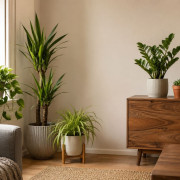
Low-maintenance indoor plants for home, office, and gifts
Choosing an indoor plant is easier when the space, light, watering routine, and people caring for...
-
How to choose a bouquet by personality
A good bouquet is not only about fresh flowers and a clean arrangement. In retail floristry, the ...
-
Top 10 Spring Flowers and Plants for Home and Gifting
Spring changes not only demand, but also the logic behind floral choices. Some options work bette...
Categories
Hot offers

Country Blues

Playa blanca


